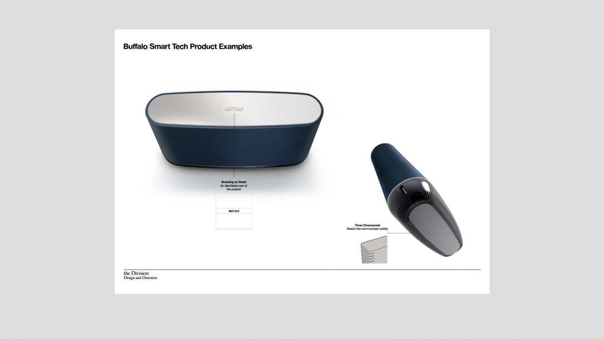
We had been working with Buffalo for many years on individual peripheral design projects before they asked us to create a design identity for all their products.
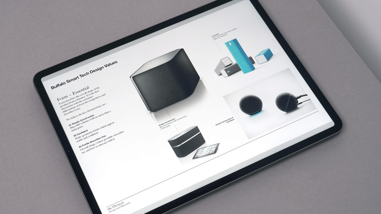
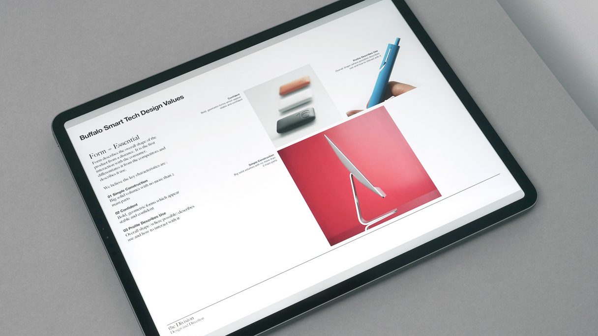
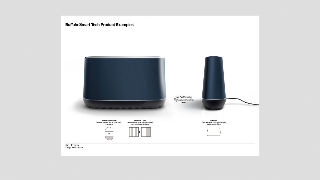
We began by looking at their brand attributes and how, by using best practice examples, the physical design of future Buffalo products should communicate the brand promise. These were broken down into form, detail, colour and material etc.
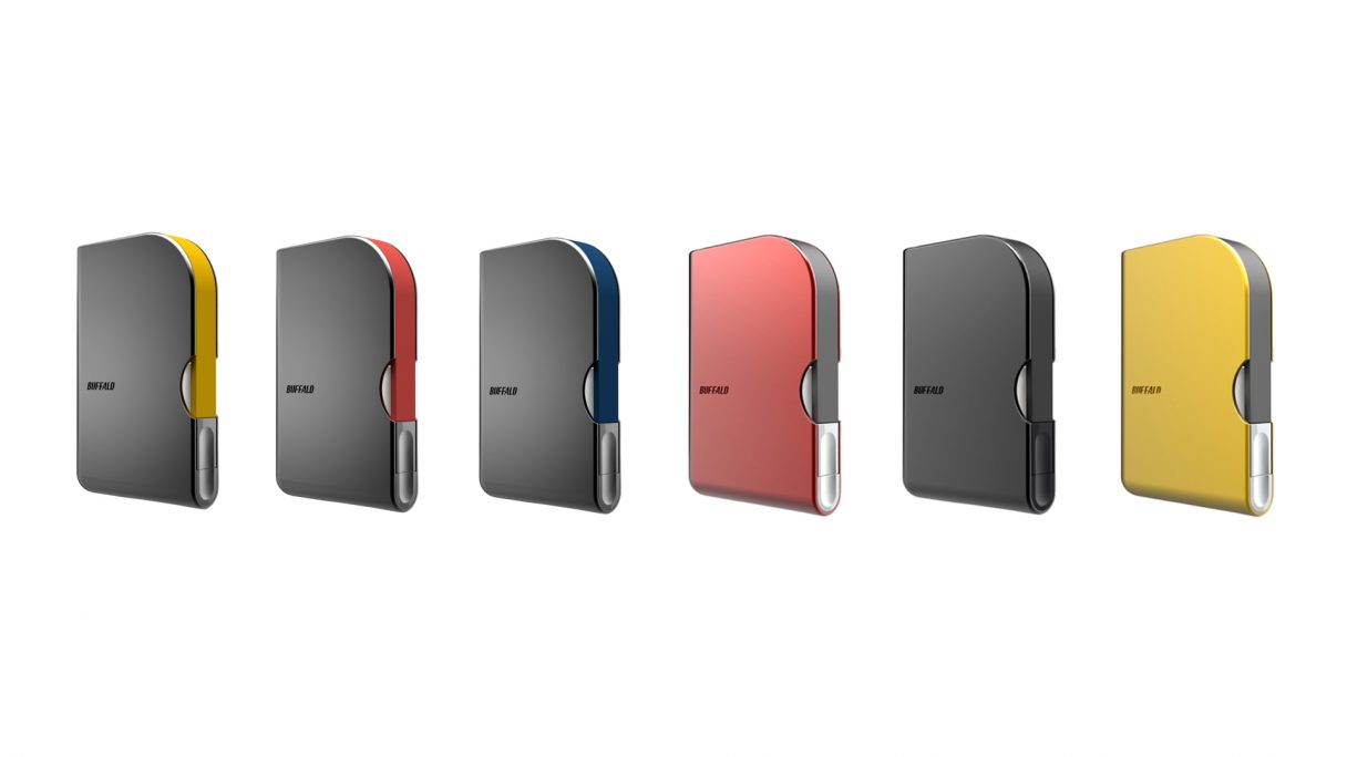
To highlight our thinking, we created product examples for the Buffalo Design Team as reference for future products. Some of these have now gone into production.
私たちは、Buffaloから全製品のデザインアイデンティティーの構築を依頼される以前から、長年にわたり彼らと個々の周辺機器デザインのプロジェクトに取り組んできました。
私たちはまずBuffaloブランドの属性を知り、優れたプラクティス(実践)を使って、未来のBuffaloプロダクトのデザインがどのようにブランドプロミス(約束)を伝えるべきかを検討しました。これらは、形状、ディテール、色、素材などに分解されました。
私たちの考えを明確にし、未来のプロダクトの基準として、Buffaloデザインチームのためのプロダクト例を作成しました。それらのいくつかは現在、製品化されています。
RELATED
-
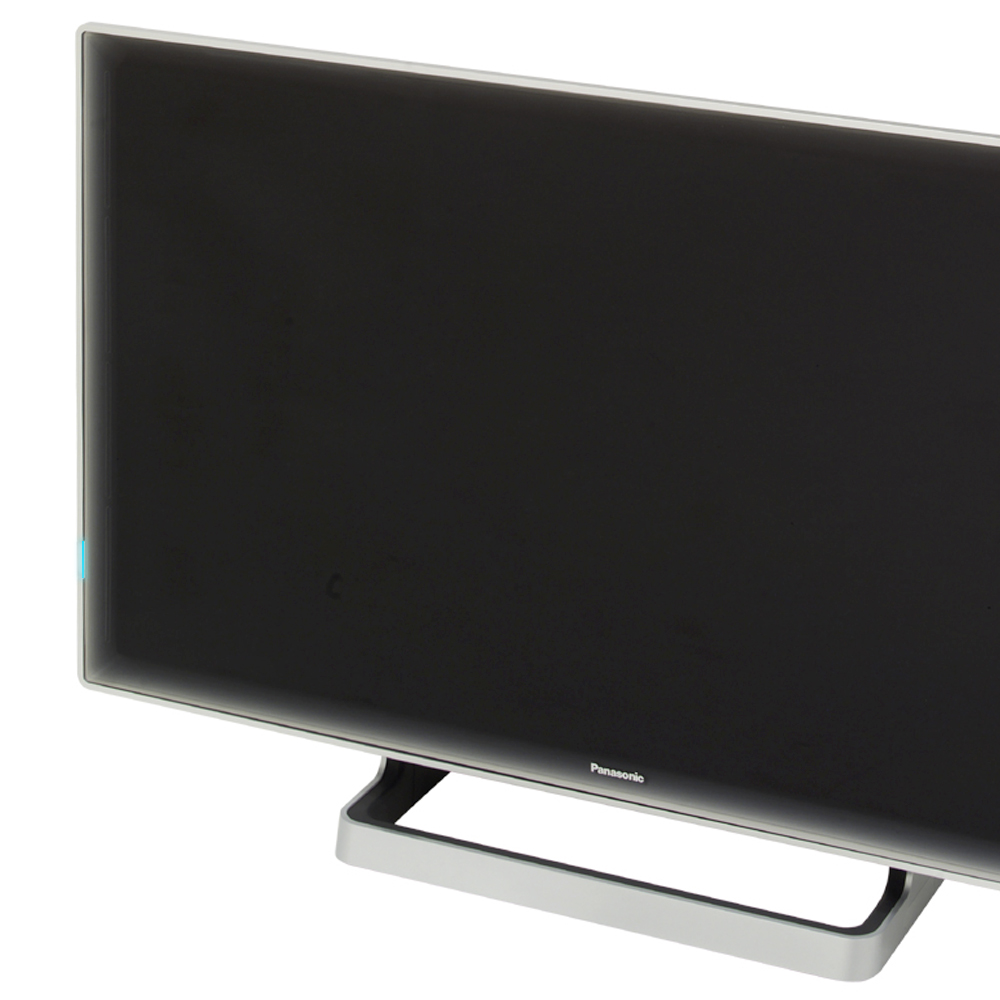
Panasonic – Design Identity
Panasonic had no consistent ‘look and feel’ for its audio visual products, consumers couldn’t tell them apart from other manufacturers. We were asked to help them change this.
-
Plastic Logic – E Book
Plastic Logic make flexible e-ink displays, they asked us to create the ‘i-pod of books’, to do this we
-
Samsung – Video App
A research and UI design exploration of the future of video for both cameras and mobile phones.